

want to work together? let's chat
YMI

sk-002
BI Brand identityBS Brand strategyP PartnershipsM Marketing
Case
Lately, conversation is often reduced to nothing but noise. Being the loudest has become more important than respecting different viewpoints. YMI stands for open-minded souls who dare to embrace difference. An ever-changing community that meets in the midst of controversy, engaging with ideas and daring perspectives that challenge how we see the world.

the launch
YMI (pronounced “Why Am I”) is an alcoholic lemonade made from fresh juice and fermented with champagne yeast, resulting in a 4% alcohol content. From the outset, YMI was conceived as more than “just a drink”. It had to be a conversation starter — drawing inspiration from music and cultural institutions that, at their best, create temporary utopias: moments where people come together, exchange perspectives, and feel understood. The brand positions itself around difference rather than consensus. It speaks to people who are comfortable with contrast, contradiction, and individuality — and who value respect over agreement. In that space, YMI becomes less about defining a group, and more about creating moments of recognition between people who don’t all have to be the same.
Built around narrative
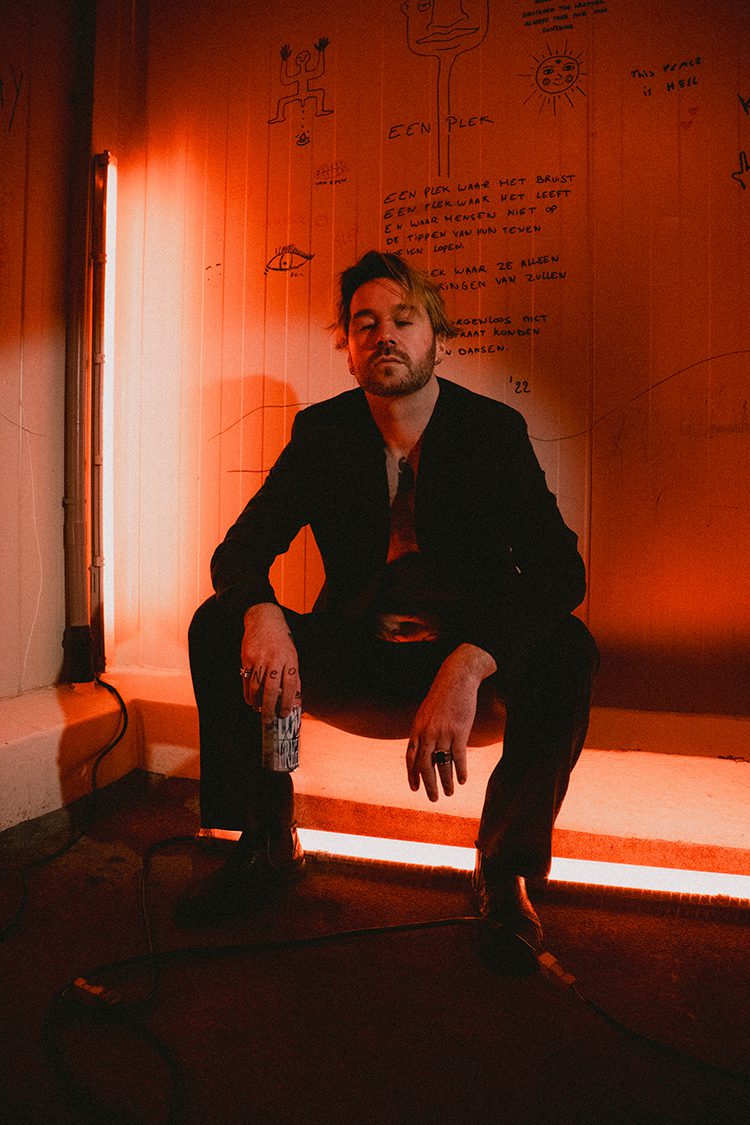
Understanding each other starts with sharing perspectives. From that insight, the brand was built around narrative — giving stories the time and space they need to unfold. Only then can they resonate and last. Every layer of communication followed this logic, from a long-form documentary to the cans themselves. Each element existed to spark conversation. The first stories featured Dana Montana and Bogenna Ivana. Rather than focusing on achievements or status, the approach centred on a single question: What’s your “Y”? That question became the foundation of the launch. Their answers shaped the stories on the cans and formed the basis of a 45-minute documentary, later structured into ten chapters and used as the starting point to introduce the brand. View the documentary
Every can is a story
The cans were never treated as surfaces for branding alone. From the start, they were designed as physical extensions of the narratives they carried — embodying what the brand stood for, rather than simply representing it. DECONSTRUCTING THE CAN:01. The phrases “Take Space” and “Love Freely” appear as direct reflections of each subject’s “Y” — distilled from their stories and translated into core messages.02. A hand-drawn signature grounds the design in authorship and presence.03. The textures used to colour the cans originate from objects closely tied to each subject’s identity, abstracted through heavy editing until they become atmosphere rather than illustration.04. A short synopsis introduces the story behind each can.05. The subjects’ portraits appear subtly at the bottom of the cans, embedded in a metallic layer, allowing them to blend into the surface and give space to the narrative itself.
Those involved
ASSIGNMENT STUDIO KRING:01. Brand Strategy: Developing brand DNA and cohesive brand narratives.02. Strategic Planning: Data-driven brand positioning and long-term growth strategy.03. Partnerships: End-to-end management of brand collaborations and sponsorships.04. Integrated Marketing: Holistic oversight of multi-channel campaigns and brand presence. PRSPCTF & Veronika Zonova:01. Brand Strategy: Developing brand DNA SSNN:01. Brand Identity: Developing visual DNA